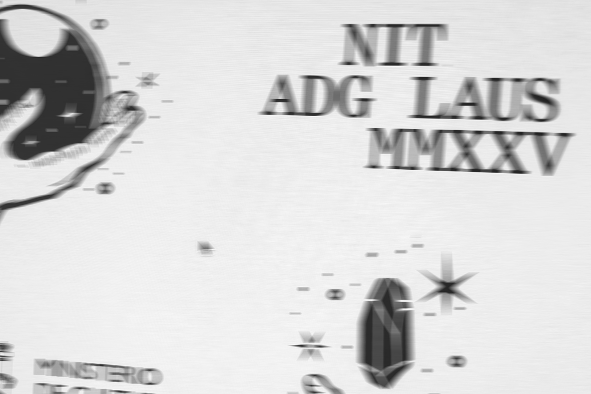
Rituals: the ADG Laus MMXXV Awards campaign
The visual identity of the 55th ADG Laus Awards explores the rituals that accompany creativity: superstitions, intuitions, and gestures charged with desire. An analog and symbolic aesthetic bridge the everyday and the ceremonial in Spain’s leading graphic design and visual communication awards.

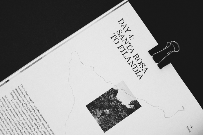
More magazine than ever: Raw Magazine’s transition to print
Exploring new editorial territories and bringing a digital journey into print. With Raw Magazine, we embraced the challenge of their leap to print with Issue Zero — art direction, editorial design, and visual storytelling.

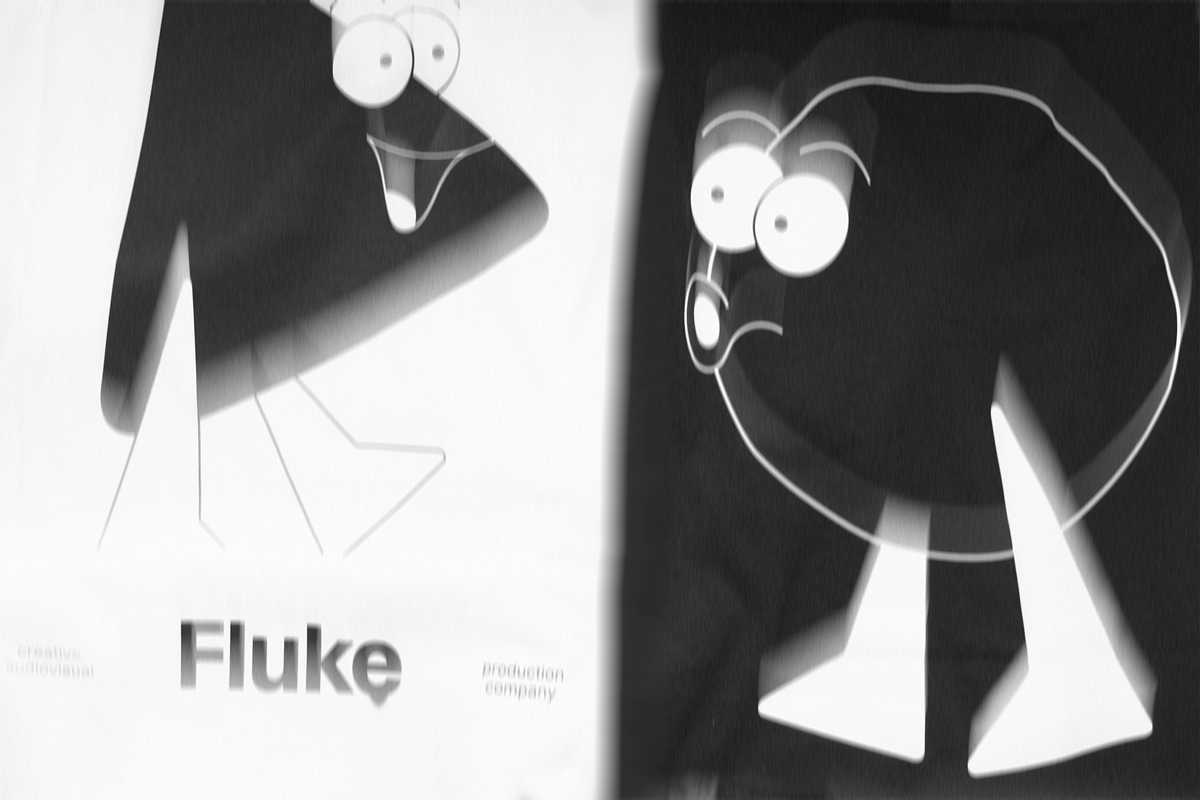
The redesign of Fluke: the glow-up that drives its evolution
Fluke is a multidisciplinary creative audiovisual production company based in Terrassa and focused worldwide. This was one of the key conclusions we reached after the process of diagnosis, analysis, strategy, and the development of its verbal and visual identity.

The theatrical classics from a new perspective
The Compañía Nacional de Teatro Clásico (CNTC) was looking for a new conceptual path for the 2021/22 season, a new look that would leave behind a season marked by Covid-19 with new ambitions. This objective served as inspiration to create the concept of the new campaign: See the classics from a new prism.
Based on this idea, the prismatic and kaleidoscopic effect was applied to all graphics, offering a new perspective that combines the elegance of the past with the vibrancy of the future.

Oh!pera, Art Revolution
Graphic campaign for Òh!pera, a series of three newly created micro-operas.
During the conceptual journey we have explored different paths that conclude in the point of thinking of art as a revolution and representing this movement in the image and in the visual system, generating impact in all the pieces.
Rescuing brutalist aesthetics and using limited resources, we propose a clear and synthetic information architecture where we highlight the message from shocking symbols with the aim of attracting attention, demonstrating that the optimization of graphic resources it can always accompany a concept and enhance the message.

Sexism in the jargon of visual communication
Lately I’ve had conversations with women and men who have used the terms “feminine” and “masculine” as adjectives to refer to design styles. and they have justified themselves: “understand me, I say this to imagine the visual”.
It is in our hands to change these dynamics (which are unfortunately very common). and you don’t need to be great public figures or prominent activists to invite anyone around us to reflect and deconstruct thoughts that we have taken for granted.
As communication professionals we have great power: if we put on the purple glasses during the working day, we can detect and modify attitudes that slow down the change towards an egalitarian scenario. discussing and providing resources to speak from an equality perspective, makes me feel part of the struggle.
”Male” and “female” should not be adjectives and replacing these terms with others is a very easy exercise, as well as putting into practice as much inclusive language as possible.
